Featuring branding across a variety of business collateral.

Gooddog
Gooddog is a dog walking and pet sitting service. As a small business, the owner wanted a unique and friendly brand look to represent her and her love of animals. The illustrative, lovable lab icon sets off the collateral together with a fun and vibrant color pallette. The collateral has a friendly and approachable characteristic that's easy to like and helps brand the owner's personality and set an expectation for potential customers.
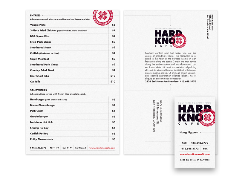
Hard Knox Café
A soulfood restaurant situated along the railway in San Francisco's Portrero Hill district, Hard Knox Café serves up classic dishes like fried chicken and collard greens. I designed a menu and business system for the restaurant. The menu serves a dual role as both a menu and mailer. The menu items are listed on the reverse of a mailer format and restaurant overview. Graphic details hint at the restaurant's location along the train tracks, with gridded lines that hint at a train schedule or ticket. Dotted line details lead the eye from front to back of the mailer. Giving the menu a double purpose allowed the owners to keep design and printing under a tight budget and easy to update. Several challenges were solved in a clean and polished look.
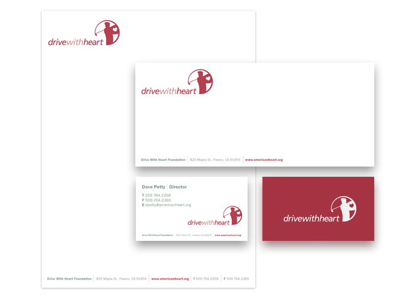
Drive With Heart
The Drive With Heart Foundation works alongside the American Heart Association and puts on an annual celebrity golf tournament whose proceeds go towards research. I designed a business system for the organization. The system has a clean look that is set off by the swing icon and rich red. It provided a professional and consistent look for the organization as they continued to grow the tournament and further establish the charity.


Futura Precast & Stone
Futura Precast & Stone manufactures concrete and fiberglass reinforced products used in architectural applications. The products have a variety of finishes but are all based off of a fiberglass and concrete material. The business system builds off of the strong, cut Futura logotype. The system uses a slate paper stock as the backdrop to the natural color pallette and pop of color for a tranquil, solid feel.

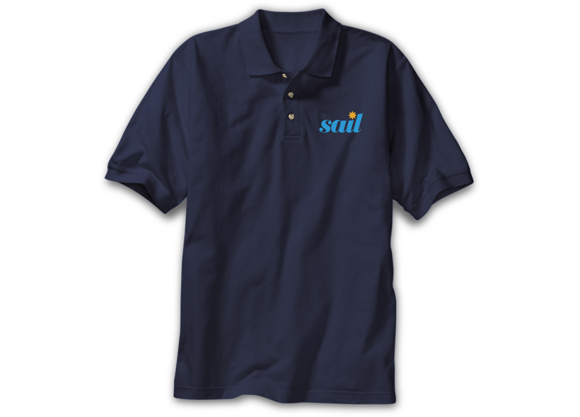
Summer Sailstice
Summer Sailstice is an annual sailing event celebrating the longest day of the year, the summer solstice. As a global event, the organization wanted a clear and consistent brand and a business system as they proliferated their love of sailing. The energy and tone of the organization is one of fun and so a vibrant blue and natural gold color are front and center in the system set on a natural-toned stock. An elegant curve supports the natural lilt of the logotype and adds further personality.
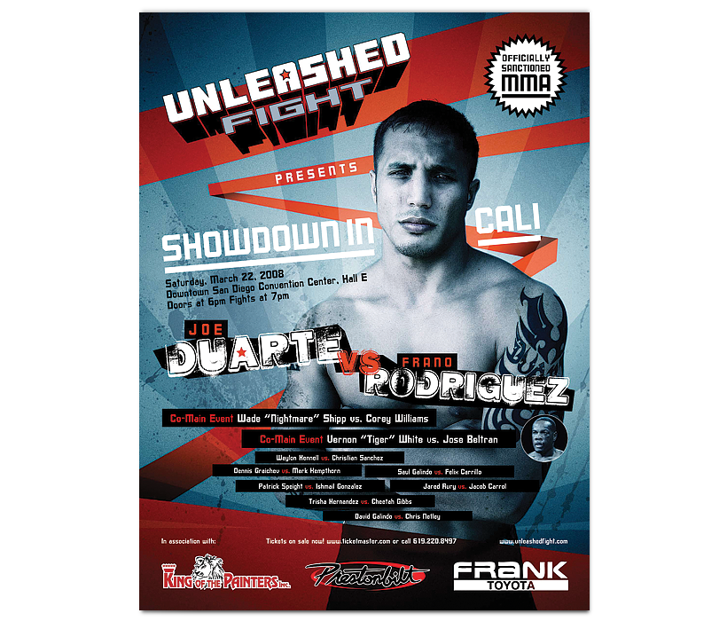
Unleashed Fight
Unleashed Fight was putting on an MMA fight in San Diego, CA and needed a fight poster to promote the event. I leveraged the grunge and grit of the genre of the event on the imagery and backgrounds. I counter balanced vector shapes and a pop of color against that grit and added drama to the hero shot. The piece heightend awareness for Unleashed Fight's first fight and helped sell out the event.
CONNECT
I'd love to hear from you. Email me or give me a call at 619.518.4651 to get things started.